In this episode, we are going to get into the debate surrounding Google Slides vs Google Jamboard: which is better?! We will go over the features and uses of each, and then give an overall opinion.
If you like what you hear, share this episode with a colleague or friend, and make sure you subscribe so that you don’t miss out on any new content! If you are able, consider supporting the show by buying us a coffee!
We would love to hear from you – leave a comment here, OR check out our FLIPGRID!
Show Notes
This week we wanted to weigh in on the Google Slides vs Google Jamboard debate! We think both of these tools are quite amazing, but thought we’d explore which one is better.
We will approach this based on features, being sure to break it down for each tool to determine which one is more effective based on that feature. At the end, stay tuned for our overall pick!
Getting Started with Google Slides vs Google Jamboard
If you go to slides.google.com or jamboard.google.com to get started, there is a template gallery for slides. This does not exist for Jamboard! While there aren’t official templates from Google for Jamboard, there are lots of templates becoming available online from a variety of educators.
Slides templates are quite helpful. There are some great education-related templates, and your domain can also offer customized templates that can be used by staff.
This certainly gives a slight advantage to Slides – though I wouldn’t be surprised if Google starts compiling templates in the near future. Google Jamboard is a newer tool in the Google Workspace, and its popularity is growing – so I would be surprised if a template gallery wasn’t added to Jamboard.
Customizing Backgrounds in Google Slides vs Google Jamboard
In Slides, it is quite easy to customize the background of a single slide or all slides in a presentation. It can be done quickly and easily in one single edit/action.
In Jamboard, however, you have to change the background of each frame separately. We have given this feedback to Google (and you should too!), but at this point, you have to toggle to each frame and add the background image each time.
We also were wondering about the resolution, and why it seemed that Google Slides had much better image resolution than Google Jamboard.
That being said, we figured out why! You want to make sure that the image is 1920×1080 pixels, or 16:9 in terms of the best aspect ratio. Check out our blog post about customizing backgrounds in Google Jamboard for more info!
This one is a definite loss for Google Jamboard.
Interaction: Google Slides vs Google Jamboard
In terms of interaction with students, we believe that Google Jamboard is the better tool. With Google Slides, you would have to take the time to set it up and ensure that you have all of the images, etc. that you are going to need. With Jamboard, the toolbar has sticky notes, shapes, marker, etc are all accessible right away for students.
Plus, students know what to do once they enter a Jamboard – they are expecting the interaction and the use of the various tools. In Slides, students are not anticipating an interactive activity, but more of a presentation.
The marker tool alone makes Jamboard the dominant tool. Slides does have the scribble tool, but it really is not the same.
Another part of Jamboard that dominates for interaction is the Sticky Notes! We love how easy it is to use the sticky notes in Jamboard. You could insert a bunch of sticky note images in slides and have students drag, drop and write in them, but it is not as effective.
The one downside of Google Jamboard collaboration: while we have read that we should be able to have up to 50 collaborators, it doesn’t always appear to support multiple users.
Original Google Jamboard
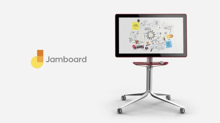
Jamboard was created to be used with an actual physical digital whiteboard, similar to SmartBoards. The app was created to be used with a physical board, and not necessarily as a standalone app like Google Slides. Up until the Spring of 2020, Jamboard was fairly underused, because there wasn’t a need for a digital whiteboard that could be used virtually, outside of a physical bricks and mortar building.
That being said, once the pandemic hit, educators were in search of digital tools that would allow them to use it similar to a whiteboard – and voila! Modern use of Jamboard began!
Google has been amazing in the ways that they have supported educators and students, and as always, they have been quite responsive to the feedback given to them by educators during emergency remote learning. Many changes have been happening to fix some of the issues and to further improve this tool for education.
With that in mind, we do believe that Google will continue to improve Google Jamboard
Adding an Image: Google Slides vs Google Jamboard
The ability to add an image to either of these tools is considered a tie. Both tools allow for Google Searches, and to insert from drive, upload, etc. So ease of use in terms of adding an image is a draw in this round of Google Slides vs Google Jamboard.
Explore Feature

One feature of Google Slides that we enjoy is the Explore feature! This allows you to search the web, your drive, Google images, etc. right from within your Slide deck.
This feature is missing in Google Jamboard. It would be great if this could be added to Jamboard! Students could look up articles, do a bit of research, add files from your Drive, and more! It would be amazing if you could even click, drag and drop a website that can be viewed from a Jamboard!
Features Available in Google Slides vs Google Jamboard
This area is a clear win for Google Slides. Google Slides by far has more features available than Google Jamboard. On top of that the web version of Google Jamboard has much fewer features than the mobile app version – which is quite frustrating! It would be great if, at the very least, the web version and mobile version were the same.
Number of Slides vs Frames
In this round of Google Slides vs Google Jamboard, Google Slides comes out ahead again. In Google Slides, there doesn’t appear to be a maximum number of slides that can be added to a presentation.
Google Jamboard, however, maxes out at 20 frames. This is quite limiting, and a little disappointing, because it means that if you want students to create a frame of their own, you’d need to create multiple Jamboards OR you’d have to have them share frames if you have more than 20 students in your class. A little disappointing.
Version History in Google Slides vs Google Jamboard
Currently (based on when this episode was recorded), Google Slides had Version History, something that Jamboard did not have. That being said, this is no longer an issue, as it is currently being rolled out by Google.
As such, in this round of Google Slides vs Google Jamboard, there is a tie!
Hyperlinks
As we all know, hyperlinks in Google Slides is easy. Google Jamboard, however, does not allow for hyperlinks. It would be great to be able to insert hyperlinks in a Jamboard, as it’s a really good way to connect docs, websites, etc. to a Jamboard.
Any time that you want interaction but require a shared resource, Slides is the tool that makes the most sense to use. It really isn’t logical to have to use two tools in order to get the interaction we enjoy from Jamboard.
Audio & Video: Google Slides vs Google Jamboard
At this point, audio and video are not available in Google Jamboard, so Google Slides takes the win in this round. It would be amazing if video or audio could be added in a frame, but it also brings about the question of purpose and goal again, which leads us to think that perhaps Slides would be the appropriate tool for that job anyhow!
Features
Limited features of Google Jamboard makes it super easy for students to learn this tool. Slides, on the other hand, it quite complicated and overwhelming for students, especially if they are newer to technology.
In this way, we do feel that this is a win for Jamboard!
Workspace in Google Slides vs Google Jamboard
Accessing the workspace in Google Slides, especially if you are changing the dimensions of your slides, can be quite difficult! The zoom/magnifying tool is quite annoying to use, and this makes it far more complicated than it needs to be when using Slides.
In Google Jamboard, however, the workspace is always easy to access, and there’s no annoying zoom tool that you have to use.
Changing the Dimensions
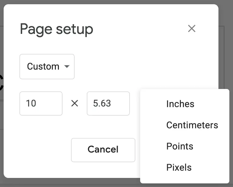
In this round of Google Slides vs Google Jamboard, Slides comes out ahead with the ability to change dimensions. This allows you to create an 8.5×11 handout, or any other specific size that you are looking for.
This feature is not available in Google Jamboard, so you are stuck to the one size for all frames.
Adding to the Grey Space around Google Slides vs Google Jamboard
In Slides, you are able to add images, shapes, etc. around the actual slide itself. Those can then be moved onto a slide, or you can keep it around the edges. For example, you can put instructions, links to breakout rooms, etc. around the sides.
This is not a possibility with Google Jamboard. Everything must fit in the frame itself with Jamboard, so it isn’t as efficient as Slides for this reason. Now, many people may not even know that adding to the grey space is an option, so if it doesn’t bother you, then keep using Jamboard!
Editing the Master
One great feature of Google Slides is that you can easily change font, colour schemes, etc. within the Master, and this will automatically change it in every single one of the slides.
This is a really handy feature to have, as it makes images, etc. added to the master more permanent, and super easy to change for an entire slide deck.
In Google Jamboard, they have now added the option of adding custom backgrounds, which certainly helps, but students (or anyone with editing privileges) can go in a change that background image fairly easily. In addition to that, there is no Master that can be changed in Google Jamboard.
This certainly goes back to the question of purpose – perhaps this isn’t a features that is really needed in Jamboard? Perhaps it functions just fine without it!
Comments in Google Slides vs Google Jamboard
One thing that we are a bit surprised about is the inability to leave comments. Google Jamboard does not have the option to leave comments at all. This makes it more complicated if you want to give feedback to a group or person that has used this tool.
In Google Slides (much like the rest of the Google workspace), comments are easy to use and add, allowing for feedback, suggestions, etc.
This is a little disappointing, and quite strange for Google. We are hoping that perhaps this will be an added feature for Jamboard as Google continues to tweak and change this tool.
Backgrounds in Google Slides vs Google Jamboard
One thing we love are the built in background options available in Google Jamboard. Graph paper, lined paper, etc. make it so easy to insert and get working right away. The chalkboard is also quite great, and allows for great contrast.
Inserting Diagrams in Google Slides vs Google Jamboard

One hidden feature in Google Slides is the ability to insert a variety of different diagrams. And while they may not live in Jamboard, they are quite easy to recreate in Google Jamboard. Plus, the sticky notes make it easy to switch the order, add more to a timeline or diagram, etc.
One suggestion is to create a diagram template in Slides, save it as an image (jpeg or png) and then set that images as your custom background in Jamboard.
From there, Jamboard allows you to create these diagrams as a class, making it so much more interactive and meaningful than creating it yourself for students to read, but not take part in the creation. This could be a great review activity in many different courses!
Always Go Back to the Purpose of the Tool
No matter what the features are, or which tool has a better range of features, etc. it’s important to always go back to the purpose for using the tool. The most important factor in choosing a tool is to ensure that it is the best fit for what you are looking to do with that tool. If you don’t need a whole lot of features, or you don’t have a lot of students that need to access it at the same time, then it doesn’t really matter the differences – it only matters that you can accomplish your goal by using that tool.
Google Slides has been around for a while, and so it’s easy to clearly understand the purpose: delivering lessons, hyperdoc style lessons or handouts, digital worksheets, etc.
Google Jamboard is a fairly new tool in the Google Workspace. Now with EquatIO integration, it has become a great tool to be used as a whiteboard, plus it has more interactive features that allow for students to easily figure out how to use it.
It’s also amazing to see how educators have really reimagined many of these digital apps and tools.
Overall: these two tools are just different! One has been around for a very long time, and one is up-and-coming. Start by figuring out your goals for that lesson, and figure out which one is the best fit based on your goals.
Katie’s Winner: Google Jamboard
This is the winner due to the interaction built into this tool. In a classroom setting, there are so many different ways to present information, but an interactive tool that is easy for students to use and understand is a definite winner.
Rachel’s Winner: Google Slides
Based on the work that is being done in her role as a coach, Google Slides is the winner. When delivering PD, and developing resources, Google Slides is the most logical go-to that allows for all of the important elements that need to be included. As such, in this type of role, Google Slides is the winner.
News & Updates
Google Meet Breakout Rooms
Rolling out now: Setting up breakout rooms ahead of time!
- Set up an event in Google Calendar (input each of your students as a guest)
- Get students to RSVP YES!
- Click on event – then click on the settings cog wheel beside the Google Meet link
- Set up the # of rooms, specify groups, timer, etc.
Version History in Jamboard
Google has announced that they are now rolling out version history in Google Jamboard! You can name versions, too. This is such a great feature that was missing from Jamboard previously.

